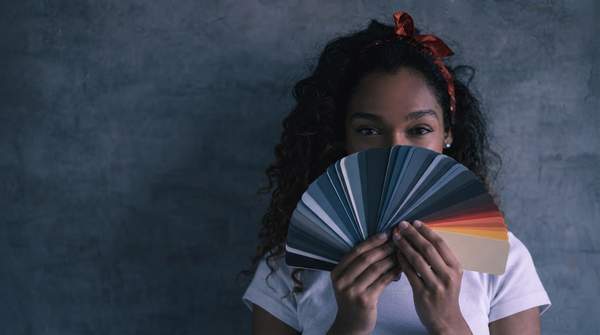
The most reliable way to choose a room's colors is to work backwards: start with what the room is for, decide the mood that function requires, and only then pick the color characteristics—warm or cool hue, high or low saturation, light or dark value—that research and design practice associate with that mood. A calming bedroom, for instance, points to cool, muted tones such as soft blues and greens; a sociable living room points to warm palettes layered over neutral bases. What follows is a working framework, the principles behind it, and an honest account of what the science can and cannot promise.
Understanding Color Psychology in Interior Design
Color psychology is the study of how color shapes emotion and behavior within a space. Designers treat color as a language: as ArchiVinci's design guide puts it, "every color communicates an idea or emotion," and practitioners use that language to shape interiors that evoke comfort, energy, or tranquility. The influence runs in two directions at once—mood and perception.
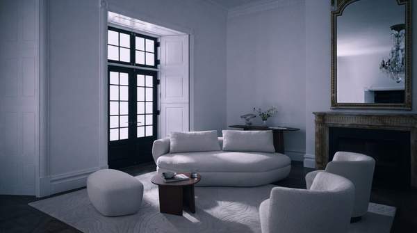
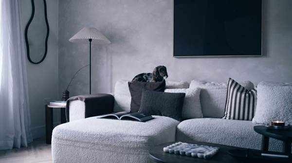
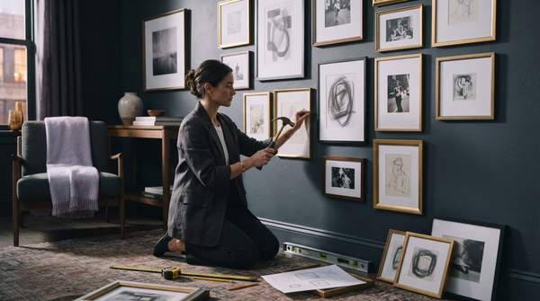
The first direction is emotional: colors sway whether a space feels calm, energetic, intimate, or open. The second is spatial: color alters how we perceive a room's size, proportion, and depth. Light tones expand a room visually, while dark hues create intimacy and focus. This dual effect is why a palette decision is never purely decorative; it sets both how a room feels and how large it appears.
The Core Principles of Color: Hue, Saturation, and Value
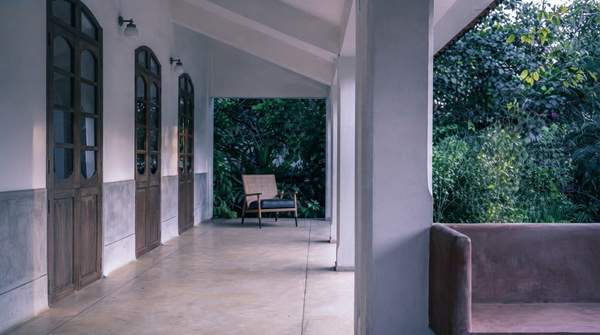
Three dimensions do the psychological work. Hue temperature is the broadest divider. Design educators at The Interior Design Institute summarize the general association plainly: cool tones like blue promote relaxation, while warm tones like red energize. Paint-industry guidance adds nuance—bright warm colors such as reds, oranges, and yellows can stimulate and uplift, while cool, peaceful colors like blues, greens, and purples read as soothing and meditative.
Saturation describes how rich or pure a color is. As Stoneside's design primer explains, deeply saturated colors stand out and look bolder, while lighter-saturation colors may appear paler. Practically, high saturation is stimulating and attention-grabbing; low saturation is generally perceived as calmer and softer—so the same blue can be restful in a muted shade and lively at full strength.
Value is lightness or darkness, and Stoneside emphasizes selecting colors with different values for harmonious contrast. Value also drives spatial perception: lighter values open a space visually; darker values make it feel more enclosed and intimate. Treat each dimension independently—a cool hue can still be energizing if it is vividly saturated.