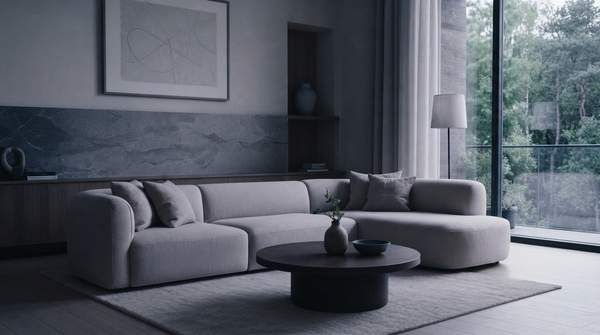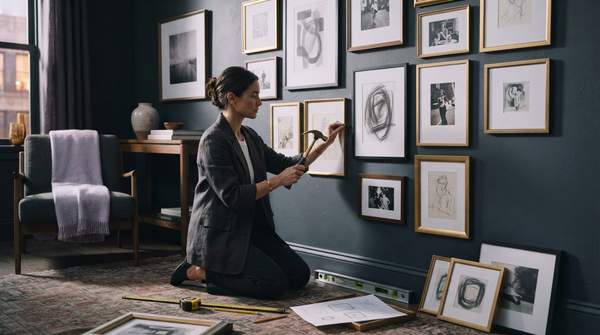
A successful gallery wall comes down to two decisions made in order: choose a layout style that matches your space and your collection, then hang it with a methodical process of measuring, leveling, and adjusting. The most common mistake is starting with the hammer. Designers who write about gallery walls consistently recommend planning the arrangement on paper or on the floor first, anchoring the composition around one strong piece, and keeping the center of the display at eye level—roughly 57 to 60 inches from the floor. Do that, and even an eclectic mix of collected pieces reads as intentional.
Introduction: Setting the Stage for Your Gallery Wall
A gallery wall is, at its heart, a curated composition rather than a random cluster of frames. Writing for Olamar Interiors, Manuela describes designing one as "a creative journey that involves careful planning," one whose payoff is a display that reflects the personality and story of the household. That framing matters for modern interiors in particular: a well-planned arrangement can carry a neutral room, give a transitional space like a stairwell a purpose, or ground a seating area above a sofa.
The practical starting point is an honest inventory. Look at what you actually own—the sizes, orientations, and tones of your pieces—before committing to a layout. Kelly of Studio DIY notes that non-symmetrical walls, which feature different types of art and different frame sizes and orientations, are easier to create, especially for people who have been collecting art over the years. If your collection is varied, that flexibility works in your favor; if it is uniform, a more structured layout will flatter it.
Core Design Principles for Visual Harmony
Harmony on a gallery wall is built from a few repeatable principles rather than rigid rules. The first is cohesion of tone. Sara Tramp, writing for Emily Henderson's site, suggests keeping pieces "similar in tone and intensity" if you want the wall to feel curated—though she is explicit that this is not a hard-and-fast rule, and a more personal, playful mix is entirely valid. The principle is a tool for a pulled-together look, not a requirement.
The second principle is balance, and it works differently across styles. Writing at About Wall Art, Mae Osz explains that classic and traditional walls lean on balance and symmetry, with matching frames and aligned centers creating a formal, elegant display, while minimalist spaces rest on spacing and alignment, using clean lines and fewer pieces to make a calm statement. In both cases, the underlying move is the same: deliberate spacing and alignment, scaled to the amount of visual material.
The third principle is restraint in framing. Grace of The Stripe recommends simple frames and a cohesive palette—matte black, pale wood, or soft neutrals—to keep a busy arrangement feeling modern, and suggests a unifying detail to tie a varied collection together. The goal, as she puts it, is "balance, not busyness."