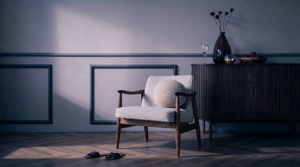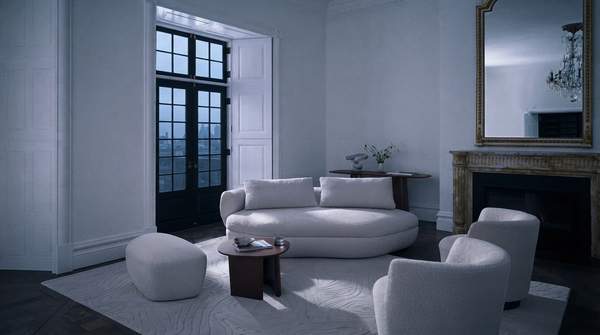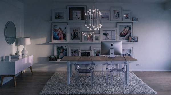
Wabi-Sabi, the Japanese philosophy that finds beauty in imperfection and transience, translates into home decor through five actionable principles: embracing imperfection and age, prioritizing natural materials, cultivating simplicity, incorporating asymmetry, and adopting an earthy palette. None of these require buying perfect new things. In fact, the approach described by The Interior Design Institute favors the opposite—interiors that show "the beauty of aging and the allure of the naturally imperfect," fostering a deeper, more sustainable connection to everyday life. The challenge for most homes is not acquiring the look but diagnosing which principles a space already honors and which it quietly resists.
The Five Core Principles of Wabi-Sabi Design
At its core, Wabi-Sabi asks homeowners to accept the wrinkles in the curtains, the patina on the walls, and the cracks in wood paneling, as House Beautiful has described the philosophy's contemporary application. This acceptance produces what might look like "unfinished" but thoughtful design, because imperfections add character rather than detracting from beauty. The first principle, imperfection and age, invites elements that reflect the wear of life: a crack in a vase, the fade of a well-loved rug, a tabletop with visible wood grain, linens with a gentle worn-in feel. Each mark, as The Interior Design Institute puts it, tells a story.
The second principle, natural materials, champions raw, organic materials like wood, stone, and linen that showcase natural textures and imperfections—and, importantly, age beautifully. The third, simplicity, follows a minimalist ethos: strip away the unnecessary so the essential can speak, creating a calm, understated atmosphere that encourages mindfulness. The fourth principle, asymmetry, appears most explicitly in Wabi-Sabi art traditions such as ikebana, the Japanese art of flower arrangement, where deliberately unbalanced composition creates natural visual interest; its specific translation into furniture and decor placement is more implied than codified. The fifth, an earthy palette, draws on muted, natural color schemes—soft browns, muted greens, warm grays, and off-whites—that let texture and form, rather than saturation, carry the room.